The Disney movie The Little Mermaid was first released to theatres in 1989.
More info about the movie...
The file when opened in a web browser appears as
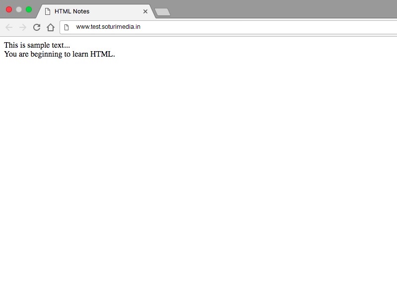
Meaning to the plain text of HTML is applied using tags. i.e. tags define all elements of the document.
Most of the tags have opening and closing. The closing is just the name of the tag with character '/' in the beginning. A tag needs to have a closing tag if it includes some content. Tag with an opening and closing can have any number of tags included within itself!
Eg: <html> and </html>.
When a tag doesn't contain any content but is just meant to symbolify something then it doesn't need the closing tag.
Eg: <br> is used to give line break in text. It doesn't have any content but just directs the browser to show the remaining content from next line.
NOTE: You might come across “self-closing” tags, whereby a br tag, for example, will look like “<br />” instead of simply “<br>”. This is a remnant of XHTML, a form of HTML based on another markup language called XML. HTML5 is much more chilled out than XHTML and will be happy with either format. Some developers prefer one way, some prefer the other.
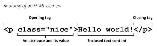
Attributes control tag behaviour.They are present in the opening tags. They consist of two parts: First is the name of attribute and second is its value which is enclosed within double inverted commas.Example:
Elements are the things that actually make up the web page. Tags just define the beginning and end of the elements. Everything that a web page includes is an HTML element.
Head of a document is the place where information about the document is written. The title of the document is mentioned in the head using the <title> tag.
This is rendered as:
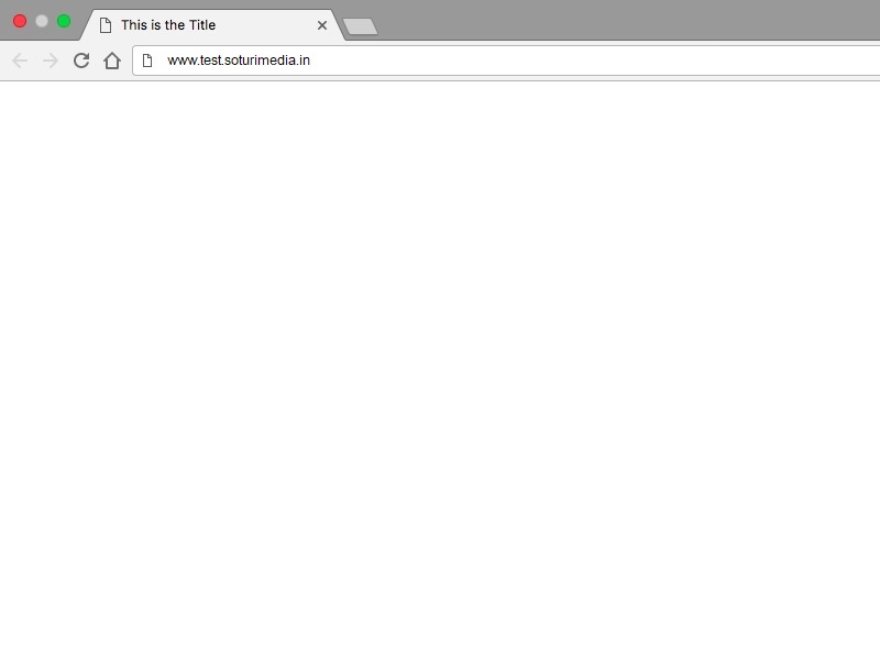
Notice the title of the page appears as the name of the tab!
Paragraphs are blocks of text separated from each other by some space. They are defined using the <p> and </p> tags. When p tag ends, the next thing appears in next line.
It appears on a web browser like this:
This is line 1.
This is line 2.
This is line 3.
When formating without p-tag, new lines are appended on the current line. This happens because the browser doesn’t see to the formatting of text. You have to use appropriate tags for formatting the text. More on formatting text would be there later in this tutorial.
There are tags in HTML to mark some content as headings. In fact, there are six different levels of headings h1, h2, h3, h4, h5 and h6. Among them h1 is the mightiest i.e. it is the largest heading and h6 is the smallest level heading.
The content appears as:
There are three type of lists in html. First two are ordered lists and unordered lists. They both are almost the same. Unordered lists are used when the numbering of items is not required and by default the items are followed by bullets. Whereas in ordered lists the items are displayed by a preceding numbering. The numbering style can be controlled by CSS that you will be learning soon!!
They are defined using the <ul> tag and the items are enclosed in the <li> tags.
The output is as follows:
Nesting of lists can be done which means that lists-items can contain sub-lists in them.
The output is as follows:
There is no limitation to the depth of nested lists.
They are defined using the <ol> tag and the items are enclosed in the <li> tags.Typically, ordered-list items are displayed with a preceding numbering. The numbering style can be of any kind like like numerals, letters or Romans numerals. The default one is numerals
The output is as follows:
Using the attribute 'start' we can specify from where the numbering starts by giving its value.
Note:Notice that value of the attribute start appeared in double inverted commas.
Nesting can also be done using ordered lists. Also a combination of ordered and unordered lists can be used!
NOTE:List styles can be changed using CSS, which you will be learning soon.
Different web pages are connected using links. They give us the ability to go to a different web page without each time entering its URL. This kind of links are external links i.e. they help in connecting to external web pages.Links can also be internal which means that they will be linking the content within the same page. For example link to the top of the page or link to any specific content.
An anchor tag a is used to define a link. The destination of the link is mentioned using href attribute. Usage:
The link appears as
Find at Image Editor
In the href attribute web address was mentioned in the above example, however it can contain address of a local file located on the computer:
Example of a link within the page:
In the href attribute, linksHeading is the id of the heading of this page. id of an html element is an attribute and it can have any value. While refering to an id, '#' is used in the begining of its name. Clicking on the link shown below will scroll you to the heading such that it is the first line of the display.
To add images in the html documents img tag is used. This tag is a self closing tag which means that it doesn’t contain the closing tag. The src attribute is used to mention the source of the image. The source of the image can be a local file or some it can be some url also.
An important attribute is alt. It provides the alternate content for the image for the users who are unable to see the image (if they are visually impaired, for example). Also, if the image fails to load then the alternate content is shown.
Note: images with different extensions like .png, .jpeg can be used. Also gifs can be displayed using the img tag.
An example:The image appears as
Tables are used to show the tabular data. To achieve this many tags are used. All the table-data is enclosed within the table tags. After that tr tags enclose table rows. Each row contains a number of data enteries which are enclosed by td tags. td stands for table-data and tr for table row. Number of table-data elements in a row are equal to the number of columns of that table. And the border attribute is used for mentioning the thickness of the borders, if the border attribute is not mentioned then there would be no border.
The table appears as
| Row 1, cell 1 | Row 1, cell 2 | Row 1, cell 3 |
| Row 2, cell 1 | Row 2, cell 2 | Row 2, cell 3 |
| Row 3, cell 1 | Row 3, cell 2 | Row 3, cell 3 |
| Row 4, cell 1 | Row 4, cell 2 | Row 4, cell 3 |
To manage the layout of the the tables, two attributes are used. One is rowspan and other is colspan. rowspan is used to mention the number of rows that a particular cell will be occupying. This is done by using the attrtibute in the td tag.
The output appears as:
| Row 1, cell 1 | Row 1, cell 2 | Row 1, cell 3 |
| Row 2, cell 1, and row 2, cell 2 | Row 2, cell 2 | Row 2, cell 3 |
| Row 3, cell 2 | Row 3, cell 3 |
Attribute colspan is used to mention the number of columns that a particular cell will be occupying. This is done by using the attrtibute in the td tag. Both colspan and rowpan can be used in th tag (table-heading tag), which is used to enclose headings in tables.Example:
The output appears as:
| Column 1 heading | Column 2,3 heading | |
|---|---|---|
| Row 2, cell 1 | Row 2, cell 3 | |
| Row 3, cell 1 | Row 3, cell 2 | Row 3, cell 3 |
| Row 4, cell 1 | Row 4, cell 2 | Row 4, cell 3 |
HTML Forms are one of the main points of interaction between a user and a web site or application. Through forms, a user enters the data which is either processed by the browser itself (using Javascript) or the data goes to the servers where it gets processed.
An HTML form may contain a lot of elements like text fields (single line or multiline), select boxes, buttons, checkboxes, or radio buttons. Let us start with just a basic form without any elements:
Since the form doesn't contain any element,currently, nothing will appear as output.
NOTE:Notice the attributes action and method. We need to tell the form where it should send the data that is entered, this is done using action attribute. There are many methods to send data to the address mentioned. Most important ones are get, and post. Method get is used when privacy is not a concern and the data is small and the data entered in the form goes to the destination as a part of the address mentioned in the attribute, whereas the post is used to send data more securely.
It is the most important element of the forms. It can take various forms using the type attribute. Here are the examples:
These were the basics of forms, more will be coming in forms advanced section later!!
Cascading Style Sheets(CSS) is a stylesheet language used for the presentation of a document written in a markup language like HTML,XML. It includes adding colors,fonts,layout to our HTML page. CSS code looks like this:
It's HTML code is:
gives the output..
There are three ways of applying it Inline,Internal and External. All these are discussed in the next sections.
Inline CSS is applied directly to our HTML code using the style attribute.
Here's the HTML code..
Output Will be..
Inline CSS
also, multiple properties can be added to an element.
HTML code is..
Will output the following..
Inline CSS
An External CSS can be applied using a complete different CSS file.
This CSS file must be linked to our HTML file using the link tag.
Here's the HTML code..
The external CSS file must be saved with .css extention, e.g."Style.css".Here's how our "Style.css" will look like..
Output will be...
This is External CSS.
An internal or in-page stylesheet holds the CSS code for the webpage in the head section of the particular file.
Internal CSS can be applied using style tag inside the head tag.
Here's the HTML code..
Output generated will be..
INTERNAL CSS
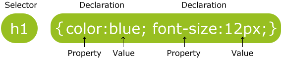
A selector points to the HTML element which we want to style.e.g..
In the above code p is the selector.In other words a selector is nothing but a HTML tag use to style that element.
A Property refers to the various CSS styles that can be applied to a selector.For e.g.
font-size, color, font-family are the properties that are applied to the selector h3 in the above code.
A value is given to a property. 30px, red, Monospace, sans-serif are the values given to the property in above code.
Properties and values are seprated by a : (colon).
In general..
The color property sets the foreground color of an element's text content, and its decorations.
All modern browsers support 140 different colors named in CSS.
You can apply any of these colors to a website or blog by using the relevant CSS code.
will output..
Also rgb() colors can also be represented by using CSS 6 Digit Hex Colors.This CSS 6-digit hex color notation allows you to specify RGB colors using hexadecimal values.
Will output same as the above.
Note:The standard format of representing hex values is #RRGGBB
RR represents the Red component of color.
GG represents the Green component of color.
BB represents the Blue component of color.
The CSS rgba() function is used to provide a color value with alpha transparency with the CSS. It allows you to specify an RGB color value with an alpha value to determine the color's transparency.
This alpha value lies from 0 to 1 from transparent to opaque.
results in..
The CSS hsl() function can be used to provide a color value when using CSS. It allows you to specify a color value by specifying the hue, saturation, and light components of the color.
gives us...
Adding an alpha value to hsl gives us the option to add opacity to our CSS by using the hsla() function.
results in..
Various Font changing properties can be applied to change the shape and size of the text in our CSS.
Changes the font to the specified style.Examples are Arial, sans-serif, monospace.
This code will output..
Arial, monospace, helvetica represents the order in which the CSS will search for the fonts in user's computer (If one is not present then it will move to other).
like..
Changes the size of our font.Values can be applied in em or px.
will show..
px
em
Specifies the weight of the font from lighter to bolder.Values can be bold, normal, lighter(100, 200, 300, 400), normal(500, 600, 700), bolder(800, 900).
font-weight: 100;
font-weight: bold;
Changes the style from normal to italics or vice-versa.
gives...
Italics
The text-decoration property specifies the decoration added to text.This property can be underline, overline, or line-through.
outputs..
Changes the case of text.It may be uppercase, lowercase, capitalize or none.
outputs the following..
Includes following properties..
here's the CSS code..
outputs..
letterspacing in css
line height in css
word spacing in css
text alignment in css
CSS borders have properties like style, color and width.For example, if we wanted to create a "teal" colored, 5 pixel border around an HTML element..
will output..
Also, border-color, border-width, border-style can be written together like..
will output same as the above.
CSS border can be styled in so many ways like solid, dotted, dashed..
CSS code is..
There are more other ways of styling the borders in CSS like double, groove, ridge, inset and outset.But solid, dotted, and dashed are most commomly used.
Also we can apply border-width, border-color, border-style to the top, bottom, left, and right individually in an element like...
This will look like..
Three important properties control the space that surrounds each HTML element: padding, margin, and border.
An element's margin controls the amount of space between an element's border and surrounding elements.Consider the box below..
CSS code is..
Now, let us change the margin of the orange-box to 25px..
Now, we can see that the distance b/w the border of orange-box and the border of the blue-box has been increased just by increasing the margin of the orange-box to 25px.
Also, we can add -ve margin values to our orange box, which will result the following..
CSS code is..
It is clear from the above that the space around the border of the orange-box and inside the border of the blue-box has been "shrunk" from the previous size just by adding a -ve margin value of 5px in our orange-box!
We can also manipulate top, right, bottom, left of our orange-box individually..
This will result in...
It's pretty clear that the margin values 5px 15px 25px 35px changes the space around the orange-box by 5px 15px 25px 35px respectively!!
Note:The margin values 5px 15px 25px 35px follows a clock-wise order from top right bottom and left respectively.
An element's padding controls the amount of space between the element and its border.
Consider the box below..
CSS code is..
As we can see, there is no space b/w the h1 element and the border of the blue-box and it looks a little messy!!
just by adjusting the padding value to 25px we get..
As we can see that the space b/w the h1 element and the space inside the border of blue-box has been increased by adjusting the padding value to 25px!!
This space has been equally distributed around the h1 element..
We can also change the padding value of top, right, bottom and left of the h1 element individually...
Will generate..
The padding value changes to 5px 15px 25px 35px from the top, right, bottom, and left respectively.
CSS borders have properties like style, color and width.For example, if we wanted to create a "teal" colored, 5 pixel border around an HTML element..
will output..
Also, border-color, border-width, border-style can be written together like..
will output same as the above.
CSS border can be styled in so many ways like solid, dotted, dashed..
CSS code is..
There are more other ways of styling the borders in CSS like double, groove, ridge, inset and outset.But solid, dotted, and dashed are most commomly used.
Also we can apply border-width, border-color, border-style to the top, bottom, left, and right individually in an element like...
This will look like..
Consider the box below..
CSS code is..
The border-radius property is used to add rounded corners to an element.
look at the CSS code below..
This will output..
Note the corners are slightly "curved" around the edges. Pretty cool huh?!..Well that's one way to apply the border-radius property.
Also, there are four-valued, three-valued, two-valued, and one-valued border-radius properties which can be specified individually according to our need.
Consider the following..
border-radius: 25px 60px 40px 15px; is a four-valued CSS border-radius property which applies individually to the top-left, top-right, bottom-right, and bottom-left respectively..
border-radius: 25px 60px 40px; is a three-valued CSS border-radius property which applies to the top-left(25px), top-right(60px), bottom-left(60px), and bottom-right(40px) respectively..
border-radius: 25px 60px; is a two-valued CSS border-radius property which applies to the top-left(25px), bottom-right(25px), bottom-left(60px), and top-right(60px) respectively..
Note:These border-radius properties can also be applied another way using border-top-left-radius, border-top-right-radius, border-bottom-left-radius, and border-bottom-right-radius.
You may also specify the radiuses in which the corner is rounded by. In other words, the rounding doesn't have to be perfectly circular, it can be elliptical. This is done using a slash ("/") between two values.
Some applications of border-radius property are given below..
HTML is used to provide all the content to the web page and helps to manage it by enclosing the content in tags. Basically, it applies meaning to the content like p tag for paragraph. But span and div don't apply any meaning. They are just used to enlose content. Then values of class and id attributes are used as CSS selectors to style the content.
The difference between div and span is that div encloses block elements and span is for enclosing parts line elements. Being a block holder div creates line breaks in the beginning and the end, while span being an inline element doesn't create any line break.
Description lists are very specific in use as compared to ordered and unordered lists and hence are very less used. But whenever, a structure like a list of terms and their description is required, the description lists are the the perfect elements. The description lists are made for that purpose only!! They are also used for holding metadata(metadata is the data that contains information about the content of the website, it helps the search engines and web-crawlers to find the relevant content).
The description lists are enclosed in <dl> and </dl> tags.The description terms are held by <dt> and </dt>. And the description data by <dd> and </dd>
It appears as:
Sections are made to group thematically related elements together. This is used in very different context from div tag which is a generic container. A div tag may contain any kind of data but using specific kind of holders makes the document much more meaningful and easy to handle. After opening a section tag, it is a good practice to have a heading tag (h1 to h6). If the chunk of data inside the section tag makes sense when viewed indepenently i.e. it is kind of stand-alone data, then the article should be used inside its place. For example a product on a e-commerce website must be included in an article tag and the all products on the web-page must be included in a section tag. The section tag can be used inside an article tag and vice-versa according to the requirement. Usage example:
Since HTML is all about applying meaning to the content , header tag is used to enclose the introductory or navigational aids. Headers may contain headings, subheadings,, navigational controls, etc. The header element may exist for the whole web page or for some content within the page
The footer tag encloses the last element of a section or a web page. It contains information about its section such as who wrote it, links to related documents, copyright data, contact-details etc.
The main tag is used to enclose the main part of the body. According to the latest recommendations of the W3C there must be only one main in a document. The content of the main should be unique to the document.
The aside tag is used for an element to add additional information to enhance the meaning. This information is not necessarily needed for understanding the content. It is also used to include the side-nav-bar of the page.
It appears as:
The Disney movie The Little Mermaid was first released to theatres in 1989.
More info about the movie...
NOTE: Suppose at some point we just want the main content to be visible and the additional content to dissapear. Instead of editing the whole HTML document, we can disable the display of all such elements using CSS selectors.
To enclose the navigation links of the same website and beyond nav tag is used. Not all links of a document must be in a nav element, which is intended only for major block of navigation links.
We can't create our own HTML tags those are pretty standard!.But the intention behind it can be fulfilled easily just by using class and id selectors.
Class Selector
The class selector is used to select a group of elements belongs to a same class like..
Let's suppose if we want to give a red color to the elements that falls under the red class and the color blue to the elements that falls under the blue class this can be done by using class selector..
This will generate..
I am red1
I am blue1
I am red2
I am blue2
The . is called as the class selector and is used to select the elements that falls under the same class.
ID Selectors
The class selector selects a group of elements belongs to the same class..On the other hand the ID selector is much more specific.It is used to select those elements having a specific id..
If we want to change the font of the element that belongs to the id one, change the color of element that belongs to id two,change the background-color of element to green that belongs to id three and change the size of the element that belongs to an id of four..
This will generate..
This is id one!
This is id two!
This is id three!
This is id four!
Also known as the id selector the # symbol is used to select an element that belongs to a particular id.
For styling content in a web-page, CSS for every element is not written explicitly. We can set properties to a group of elements using same code.
Maintaining the data in the appropriate tags, leads to minimum usage of id and class for selecting data in CSS code. This is done using nesting of selectors.
As the name specifies they are not real CSS classes, but are used to select the CSS class in a specific state! Like when you want a class to behave differently when hover(changing the color of an element while hovering or adding a shadow it) pseudo classes are used.
Syntax for using pseudo-classes:
For adding a shadow to all paragraphs when hovered the pseudo class is used as follows:
Try hovering on the paragraphs below:
Sed ut perspiciatis unde omnis iste natus error sit voluptatem accusantium doloremque laudantium, totam rem aperiam, eaque ipsa quae ab illo inventore veritatis et quasi architecto beatae vitae dicta sunt explicabo. Nemo enim ipsam voluptatem quia voluptas sit aspernatur aut odit aut fugit, sed quia consequuntur magni dolores eos qui ratione voluptatem sequi nesciunt. Neque porro quisquam est, qui dolorem ipsum quia dolor sit amet, consectetur, adipisci velit, sed quia non numquam eius modi tempora incidunt ut labore et dolore magnam aliquam quaerat voluptatem. Ut enim ad minima veniam, quis nostrum exercitationem ullam corporis suscipit laboriosam, nisi ut aliquid ex ea commodi consequatur? Quis autem vel eum iure reprehenderit qui in ea voluptate velit esse quam nihil molestiae consequatur, vel illum qui dolorem eum fugiat quo voluptas nulla pariatur?
Pseudo elements are used to address sub-parts of elements. They allow us to select specific parts of an element and set their properties. In other words they allow logical elements to be defined which do not explicitly exist in the HTML document but are a part of some other element like the first line of a paragraph, last letter .
Syntax for using pseudo-classes:
Example syntax for changing the size of the first letter of a paragraph:
The above thing appears as
Sed ut perspiciatis unde omnis iste natus error sit voluptatem accusantium doloremque laudantium, totam rem aperiam, eaque ipsa quae ab illo inventore veritatis et quasi architecto beatae vitae dicta sunt explicabo. Nemo enim ipsam voluptatem quia voluptas sit aspernatur aut odit aut fugit, sed quia consequuntur magni dolores eos qui ratione voluptatem sequi nesciunt. Neque porro quisquam est, qui dolorem ipsum quia dolor sit amet, consectetur, adipisci velit, sed quia non numquam eius modi tempora incidunt ut labore et dolore magnam aliquam quaerat voluptatem. Ut enim ad minima veniam, quis nostrum exercitationem ullam corporis suscipit laboriosam, nisi ut aliquid ex ea commodi consequatur? Quis autem vel eum iure reprehenderit qui in ea voluptate velit esse quam nihil molestiae consequatur, vel illum qui dolorem eum fugiat quo voluptas nulla pariatur?
Shorthand properties are used to mention many CSS properties simultaneously. Using shorthand properties makes the code more readable and easy to maintain.
Shorthand properties are used for define properties of an element that are related to same kind of thing. For example: property padding alone can be used to mention the padding-top, padding-right, padding-bottom, padding-left.
For example:
Is equivalent to:
NOTE: The value which is not specified while using shorthands is set to its initial value. This is a tricky thing, if the property was specified earlier, it would be overridden to the its default.
Suppose while using padding shorthand, if only one value is mentioned, then, it would be set for all sides(top, right, bottom and left), if two values are mentioned then the first one is for top and bottom and the second one is for right and left. The same thing holds while using margin.
border-width, border-color, and border-style are mentioned using the above shorthand.
This combines font-style, font-weight, font-size, line-height, and font-family.
Using the background CSS property individual backgrounds of the elements can be set.
This was the shorthand for:
For defining an abbreviation, abbr tag is used. Expanded form of the abbreviation is given in the value of the title attribute. Although this is not necessary, but is a good practice.
Try hovering above JS below:
The q tag is used for inline-quotations.They are used as:
This appears as:
And the teacher said instead of using
double-quotes you can enclose the content
within q-tag.
When there is a block of data to display, blockquote tag is used.
For using blockquote CSS has to be written for the starting quotation marks. For e.g:
NOTE: The pseudo element used above is before. It is used to select the first pseudo-element of the element on which it is applied. Then content property is used to include some content in it. The content property can always be used to add content to the selected element.
Most programmers do programming not because they expect
to get paid or get adulation by the public, but because
it is fun to program.
For representing computer code, code tag is used. For variables var is used. Sample output is enclosed in samp tags. Usage for code:
Output is:
Regular text. This is code.
Regular text. Output-sample text.
The CSS backgroud-image property is used to set the background image for an element. It can also be mentioned as the shorthand property of the background image as mentioned in the previous section. They are used in much different way then normal HTML img tag.
The very important task accomplished using the background-image is known as image-spriting. Suppose you want to show flags of three countries Canada, USA, and Mexico in three different places in a web page. Instead of sending these three as different images, one big image containing all the three images in its sub-parts is made and is sent to the browser. Now the places at which the flags are to be shown, are made to have the same image-background. Like this:
Now, at all three places, background-position is mentioned so as to include the appropraite part of the background like this:
The benefit of this is that all the images are fetched using single http request which is far more better than many request fetching small small images.
Consider the code below..
which results in..
Although the color property is applied on the same tag h2, but the later one color: blue; property will overwrite the previous one!
Consider the following CSS code..
This will output..
This time the later one doesn't took the charm!.The first one will be considered because it is more specific than the second one.Although they were intended to be applied on the same element h2.
In CSS when the code becomes a little messy, then there is a greater chance of conflict between the CSS properties, to resolve this conflict the CSS specificity comes into play!.
In the previous CSS code the specificity of div p (1 for HTML element+1 for HTML element =2) is more than that of p (1 for HTML element=1), hence the div p is more specific and it's property will come into play.
Consider the following ..
outputs..
Get it?!..The .box #one h2 will lead because of the specificity of .box #one h2 (10 for class selector .box + 100 for the #one id selector + 1 for the h2 element = 111).
Flexbox model provides for an efficient way to layout, align,
and distribute space among elements within your document — even when the viewport and
the size of your elements is dynamic or unknown.
Flexbox Froggy is a wonderful game which will give you a breif idea of how flex box works. I will recommend you to play this game first and then read this column.
How do I start using Flexbox model?
To start using the Flexbox model, all you need to do is first define a flex-container (parent element):
This is the output.

Whereas you might have hoped for this:

The Flexbox model kicks in as soon as you introduce "flexbox display" in the parent element.
As soon as you set the display property to flex, the unordered list automatically becomes the fle x container and the child elements (in this case, the list elements li) become flex items.
The Flex Container Properties
Flex-direction || Flex-wrap || Flex-flow || Justify-content || Align-items || Align-content
The Flex-direction property controls the direction in which the flex-items are laid along the main axis.
In layman’s terms, the flex-direction property let's you decide how the flex items are laid out. Either
horizontally, vertically or reversed in both directions.
Technically, “horizontal” and “vertical” isn't what the directions are called in the "flex world".
These are described as main-axis and cross axis. The defaults are shown below.
In layman’s terms again, the main-axis’ default direction feels like “horizontal.” From left to right.
The cross-axis feels like “vertical.”
From top to bottom.

These are the default axes. They can be changed.
By default, the flex-direction property is set to row and it aligns the flex-item(s) along the main axis.
This explains what happened with the unordered list at the start of this article.
The flex items were then laid across the main-axis, stacking horizontally from left to right.
If the flex-direction property is changed to column, the flex-items will be aligned along the cross axis.

The flex-wrap property can take any of the three values.
In the first example try adding more li elements and you may come across this:

This is the default behavior of every flex container. A flex
container will keep on accommodating more flex items on a single line.
This is because the flex-wrap property defaults to nowrap. This causes the flex container to NOT wrap.
This problem can be solved using the wrap value
“Wrap” is a fancy word to say, “when the available space within the flex-container can no longer house the flex-items in their default widths, break unto multiple lines.

There’s one more value, wrap-reverse.
It lets the flex items break unto multiple lines, but in the reverse direction.

3. Flex-Flow
The flex-flow is a shorthand property which takes flex-direction and Flex-wrap values.

4. Justify-content
This is the most important property of flex model. Literally makes life easy.
It take the folowing 5 values.
With justify-content property, the flex items are aligned along the main axis. Consider the first example with only 3 li child elements.


5. Align Items
It defines how flex-items are laid out on the cross axis. This is the difference between the align-items property and justify-content.


This is A "Baseline:"
6. Align Content
While using the wrap property what we
got was a multiline flex container.
The property is used on multi-line flex-containers.
Just like align-items, the default value is also stretch.


The Flex Item Properties
Order || Flex-grow || Flex-shrink || Flex-basis
1. Order
Used to reorderflex items within a container.
This is done without affecting the HTML source.
Default value is 0. May take positive or negative values.
Example:

The Flex items are displayed just as specified in the HTML source order.
Now suppose you want to change the order without affecting the HTML source.
Since Item 2, 3, 4 have default 0 order, 1 has the highest order.
If two elements have same Order they are positioned according to source.
2. Flex Grow-Shrink
The flex-grow and flex-shrink properties control how much a flex-item should “grow” (extend) if there are extra spaces, or “shrink” if there are no extra spaces.
They may take up any values ranging from 0 to any positive number.
flex-shrink: 1 default
flex-grow: 0 default

Now if flex-grow is set to 1 flex-items occupy all the available space.

2. Flex Basis
The flex-basis property specifies the initial size of a flex-item. Before the flex-grow or flex-shrink properties adjust it's size to fit the container or not.
default: auto
Flex-basis can take on any values you'd use on the normal width property. That is, percentages, ems, rems, pixels etc
By default, the initial width of the flex item is influenced by the default value, flex-basis: auto.
The width of the flex-item is computed "automatically" based on the content size (and obviously, plus whatever padding you set too).

Now if you increase the content.

But if:

4. The Flex Shorthand
The flex shorthand allows you set the flex-grow, flex-shrink and flex-basis properties all at once.
The code above is equal to setting the three properties: flex-grow: 0; flex-shrink: 1; flex-basis: auto
If you set only the flex-grow and flex-shrinkvalues, flex-basis would default to zero.
This is called an absolute flex. And when you set only the flex-basis, you get a relative flex.
/*this is an absolute flex item*/
li {
flex: 1 1; /*flex-basis defaults to 0*/
}
/*this is a relative flex item*/
li {
flex-basis: 200px; /*only flex-basis is set*/
}
4. Flex: "positive number"
"flex: 2 1 0" is the same as writing "flex:2" 2 represents any positive number.
Here you have two flex-items. One has aflex-grow property of 1 and the other 2, what then happens?
You have the grow switches turned on for both items. However, the magnitude of growth differs. 1 and 2.
They both expand to fill up the available space, but in some proportion.
Here’s how it works.
The latter takes up 2/3 of the available space while the former takes 1/3.
You know how I arrived at that?
Basic mathematics ratio. individual / total

5. Align-Self
Allows You to change the position of a single Item.


auto sets the value of the targeted flex item to the parent’s align-items value or stretch if the element has no parent.
In the case below, the flex-container has an align-items value of flex-start
CSS display properties include the following properties
inline
The display:inline property displays the elements in an inline flow. An inline element doesn't starts in a new line.Some examples of inline elements are:
This will result in..
As we can see that the li element has been displayed in a line due to the inline property.
block
A block-level element starts on a new line and stretches out to the left and right as far as it can.Here are the few examples of block level elements.A display property with a value of "block" results in a line break between the two elements.
This will result in..
As we can see that the div 2 element starts from the next line, just because they are block-level elements!
But consider the following inline-element below.
The quick brown fox jumps over the lazy dog!.
which is quite reasonable...as span is an inline-element. Now just by applying display:block; we get..
The quick brown fox
jumps over the lazy dog!
It is clearly seen that the span element starts from the next line.
inline-block
We can create a grid of boxes that fills the browser width and wraps nicely.This can be done using with inline-block, inline-block elements are like inline elements but they can have a width and height.
This will result in..
now applying display: inline-block; we get..
The boxes adjust themselves according to the browser window itself!
none
The display:none; property hides the elements in a browser.
Doesn't show anything at all!..
Before CSS2, tables were used for making page layouts. But now there are numerous CSS properties to set the layout.
statictop, right, bottom, bottom, left can't be applied.relativeabsolutefixedThe HTML code would be same and CSS would be changed to depict each positioning. The HTML is as follows:
Orignal layout CSS:
The output is:
Relative positioning:
Absolute positioning:
Before reading this section, make sure that you have read the forms-basics section.
The name attribute is very important by the perspective of backend because when the form data is sent to the mentioned address, it is arranged as key-value pairs with its keys as the values of the name attribute and values as the input provided through the form.
The output window would be like:
Checkboxes are used to get an array from the user. The name attribute is used for grouping checkboxes for the same thing i.e. the checkboxes with the same value of the attribute name would be grouped together. The value attribute specifies the value of the attribute being checked. The checked attribute is used to indicate whether this item is selected. And label element represents a caption for an item in a user interface.
The output window would be like:
Radio-buttons are like switches that can be turned on or off. They are used when out of many options, we want the user to select one option. To acheive this the value of the name attribute must be same for the options among which we want to choose the one.
It appears as:
The input tag was for smaller text inputs. The tag textarea is used for a bigger text area whose number of rows and columns can be specified using the rows and cols attributes. Sample:
Output window looks like:
The select tag is used along with option tag to display a drop-down menu.
The menu appears as:
CSS allows us to give shadows to our HTML elements.There are two ways by which we can give shadows to our HTML elements like..
text-shadow
We can add shadows to our text using the text-shadow property.
It will result in..
All this is due to the text-shadow property.The text-shadow: 3px 3px; the first 3px value is horizontal shadow, the next 3px is vertical shadow.
Check this out..
results in..
The third parameter 5px adds a blur effect to the text.
We can also add a color value as a fourth parameter to our text.
Just like text we can also give a "shadow" to our box using the box-shadow property.
look at the CSS code below..
outputs..
box-shadow: 30px -16px burlywood; The first value 30px is the horizontal shadow and the corresponding second value -16px is the vertical shadow and the corresponding third value gives it a color of burlywood!!
Note:-ve values are allowed in the box shadow property.
We can also add blur-radius to our box just by adding a third value 5px to our box-shadow property...
outputs...
This shadow can also be "spread" by using a fourth value in our box-shadow property..
As we can see that the area of box-shadow has been increased, just by adding a fourth value of 5px in our box-shadow property!
So far we have seen class selectors, id selectors and tag selectors, but there are many other ways to apply CSS into our HTML if our code becomes a little messy.
There are about 30 CSS selectors which we can use to layout our HTML.
So far we have seen selectors like tag selectors, class and id selectors.There is another kind of selectors in CSS called as the Attribute Selectors which selects the elements based on their attributes.
The [attribute] selector.
will select the element that has a lang attribute.
The "value" selector.
will select the elements that has the type equivalent to "three".
The ~ attribute selector
will select the element that includes "the" string token.
The ^ attribute selector
this selects the element whose attribute value leads with "http".
The $ attribute selector
will select the element whose href value ends with "inc"
The ^ attribute selector
will select the element whose attribute value has a substring of "ond" in it.
value1
value2
value3
The | attribute selector
will select the element whose attribute value is seprated by hyphen and matches the specified value in the CSS code.
para1
para2
CSS transition includes following properties..
translate
The translate method changes the coordinates of an element according to the specified value.
This will change the position of the box 30px right and 10px bottom.
scale
The scale property changes the size of an element.
The scale (2,1.1) will increase the width to twice and the height to 1.1 times.
rotate
The rotate method rotates an element clockwise or anticlockwise according to the specified value.
will rotate the element by 30 deg.
skew
The skew property skews an element along the X and Y axis respectively.
also we can also apply skew individually to the X,Y coordinates as well..
matrix
we can apply all the above properties together using the matrix method.
The matrix method follows the order like matrix (scaleX(),skewY(),skewX(),scaleY(),translateX(),translateY()).
For creating transitions in CSS b/w two or more colors gradients are used.
In general there are three kinds:
linear-gradient
Transition occurs from one direction to other linearly like..
results in..
The default direction of transition is from top to bottom, but we can change that transition in any direction.
follow the CSS code below..
This will generate..
Also, multiple colors can be added..
outputs..
The linear-gradient can also be directed diagonally by specifying vertical and horizontal starting positions..
Which generates..
This linear-gradient property can also be applied at an angle..
This will output..
background: linear-gradient(-90deg, red, yellow); (Standard syntax)
background: red; (For browsers that do not support gradients)
background: -webkit-linear-gradient(-90deg, red, yellow); (For Safari and Google Chrome browsers)
background: -o-linear-gradient(-90deg, red, yellow);(Opera)
background: -moz-linear-gradient(-90deg, red, yellow); (For Firefox)
repeating-gradient
The linear-gradient can be repeated itself using the repeating-gradient property.
Outputs..
The linear-gradient repeats itself again and again according to the height given!
radial-gradient
The radial-gradient property generates a gradient repeating from it's center.
outputs..
We can also give shapes to our radial-gradients by adding an extra parameter to our CSS code.
results in..
Till now, we used CSS to style our HTML content, but its scope is not limited to that. CSS can also be used to write blocks of code that are targeted to specific screen sizes. Earlier, separate HTML and CSS was written for viewing the websites on mobiles, tablets, very-large screens etc. But now, using the media queries the screen size can be found out. CSS blocks are written for different ranges of screen sizes to change only the appearance of desired content.
Basically, rather than finding out what device is being used, the capabilities of the device are looked at. Mainly, we will look at the following things:
The syntax is as follows:
After the @media keyword, there are expressions which simplify to true or false and accordingly the content within the block of the media query will be applied to the HTML. media queries may contain a media type which limits content for different kind of devices. List of main media types:
Logical operators like not, and and only can be used to generate desired media query. Also parenthesis can be used to hold the queries. The and operator is used for combining multiple media features together into a single media query, requiring each chained feature to return true in order for the query to be true. The not operator is used to negate an entire media query. The only operator is used to apply a style only if the entire query matches, useful for preventing older browsers from applying selected styles. If you use the not or only operators, you must specify an explicit media type.
Comma-separated lists behave like the logical operator or when used in media queries. When using a comma-separated list of media queries, if any of the media queries returns true, the styles or style sheets get applied. Each media query in a comma-separated list is treated as an individual query, and any operator applied to one media query does not affect the others.
when we want to target min-width: 700px and orientation: landscape:
It applies to the whole query and returns true only if the whole query returns false. In comma separated query it will negate only the media query it is applied to. The not keyword cannot be used to negate an individual feature query. Only an entire media query should be mentioned. Basically, after mentioning not keyword, media type must be mentioned.
For example, the not is evaluated last in the following query:
Is evaluated as:
In comma separated list:
NOTE:Here not will be evaluated only with the second query (i.e. the one after the comma), and notice that media type is mentioned(media type is print) otherwise the syntax would be invalid!!
The only keyword prevents older browsers that do not support media queries with media features from applying the given styles: